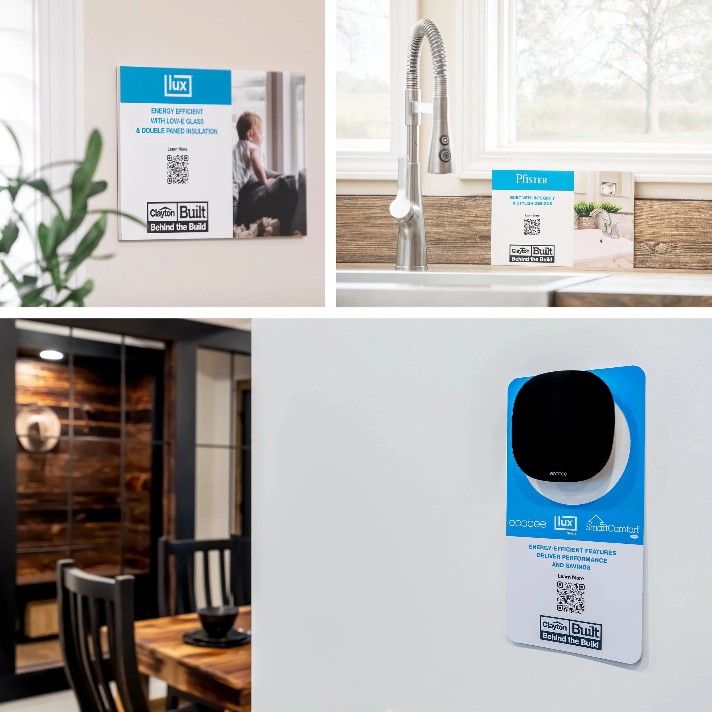
Clayton Built® Retail & Marketing Design Refresh
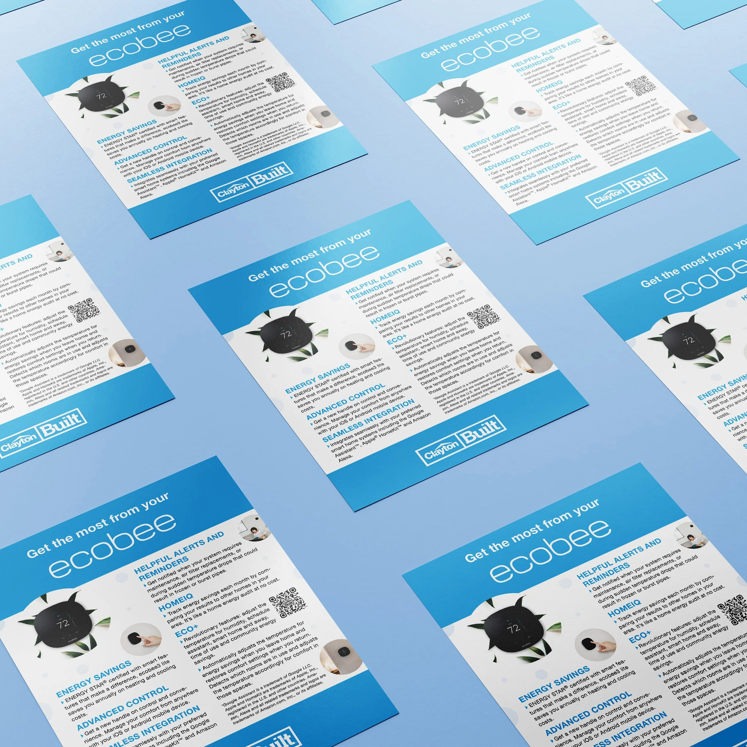
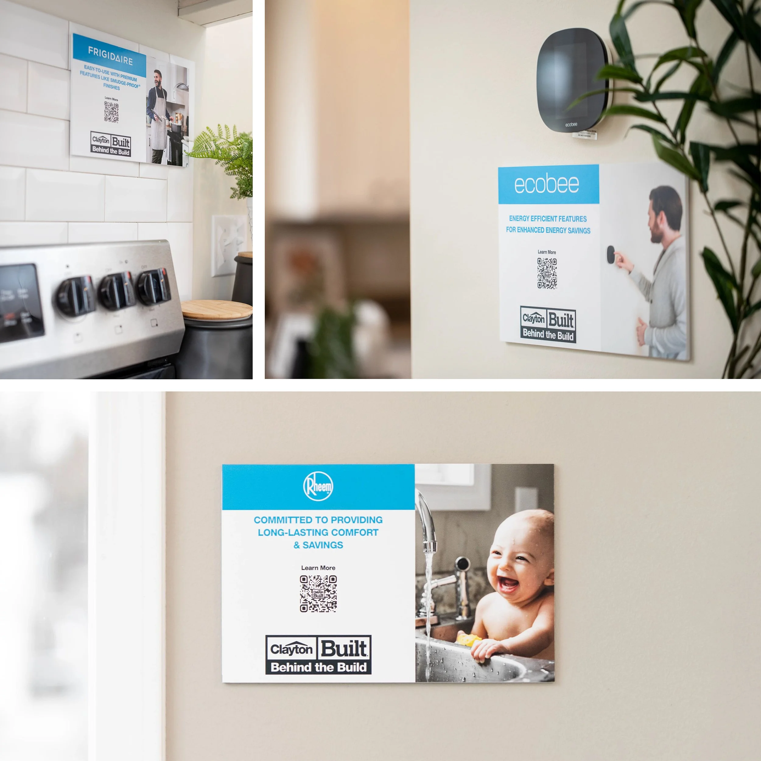
I developed new POP materials and marketing collateral that elevate the Clayton Built® design language through rich, optimized visuals and photography showcasing brand partners’ products and customers. As part of a design refresh, I applied updated color standards to introduce a fresh, timeless aesthetic across print materials. This strengthened brand consistency and delivered a cohesive visual experience for retail partners and customers.
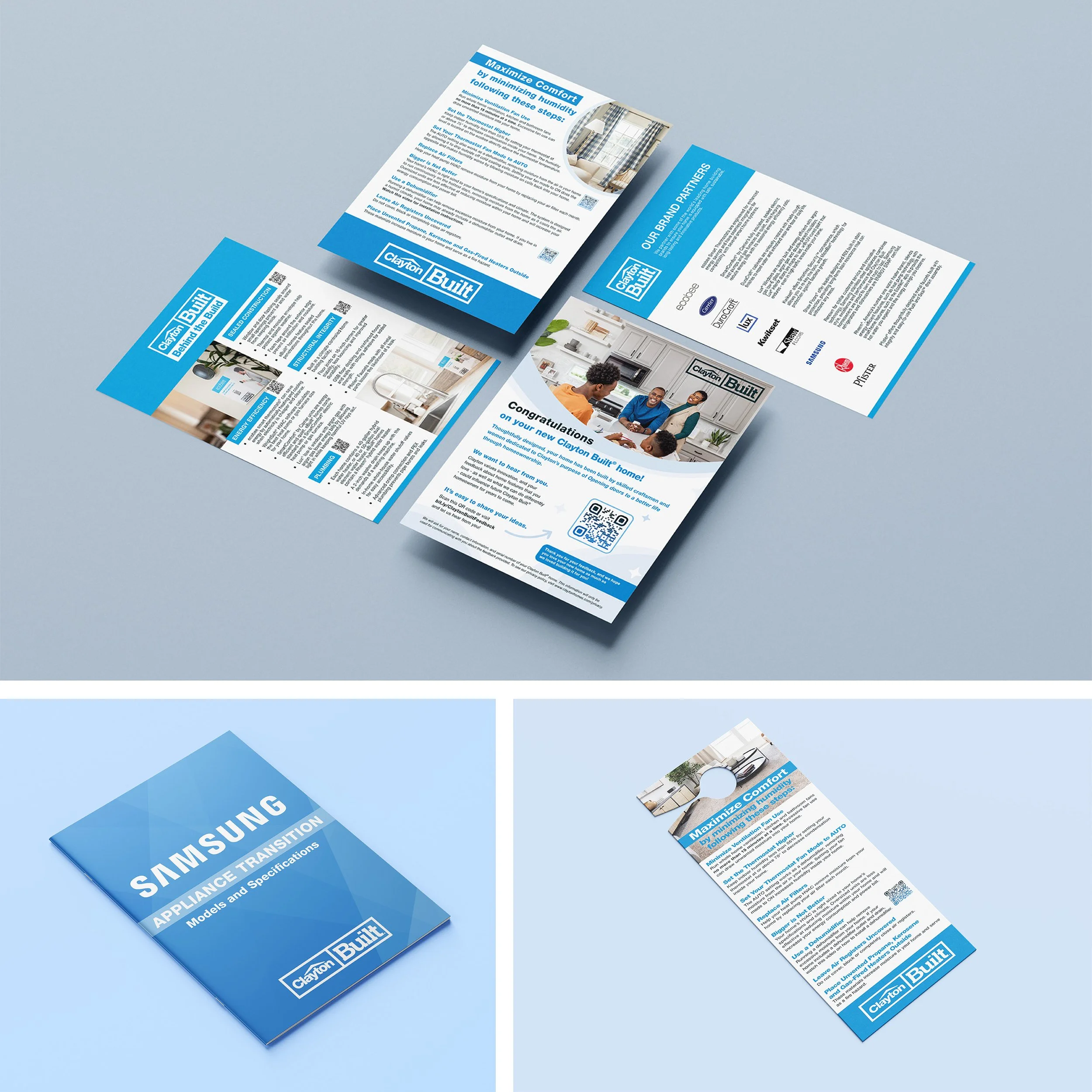
POP Designs
The new color palette reflects the company’s strength, integrity and accountability. It complements typography that balances modernity and legibility, creating materials that feel both inviting and authoritative. The result is a consistent, cohesive visual identity across all marketing materials.
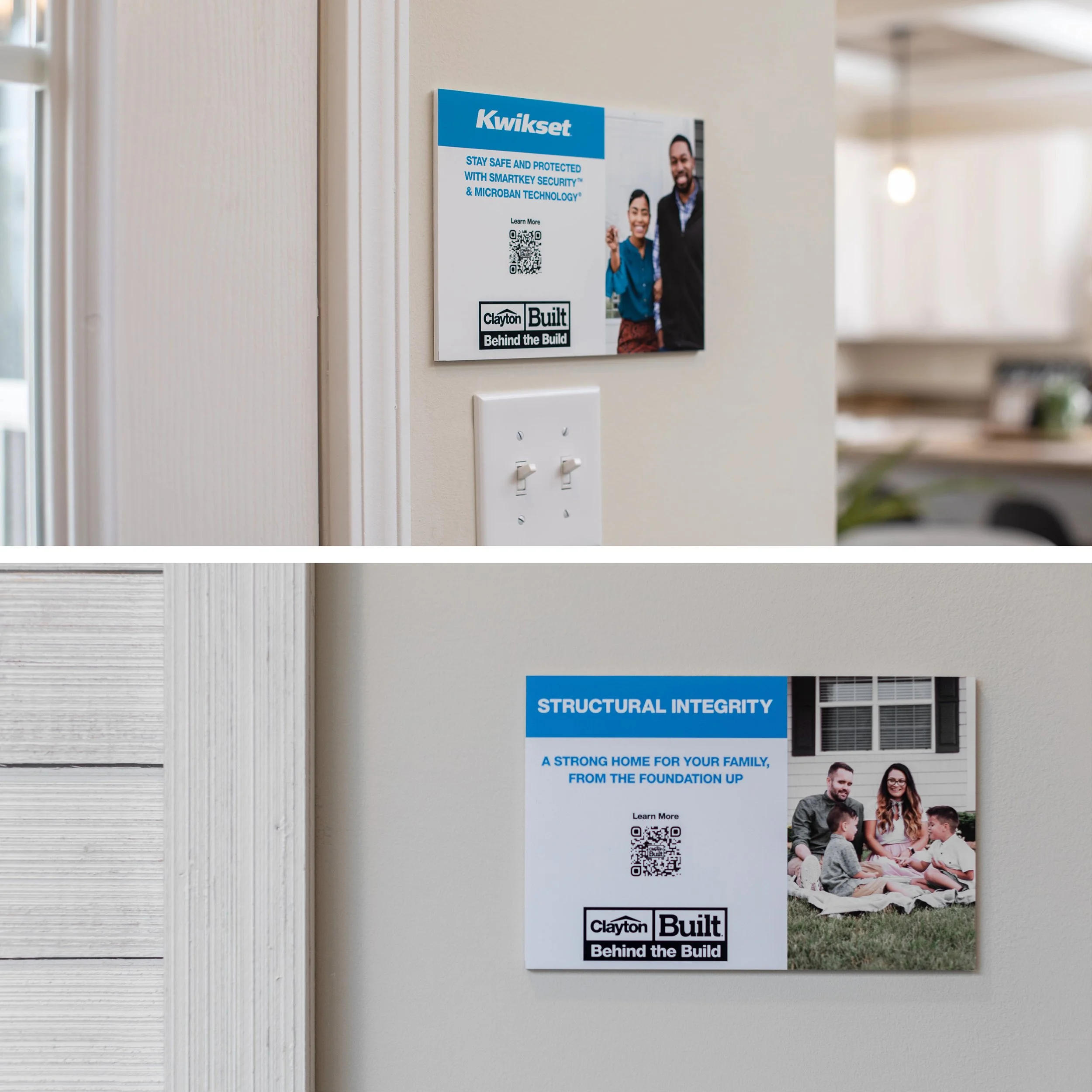
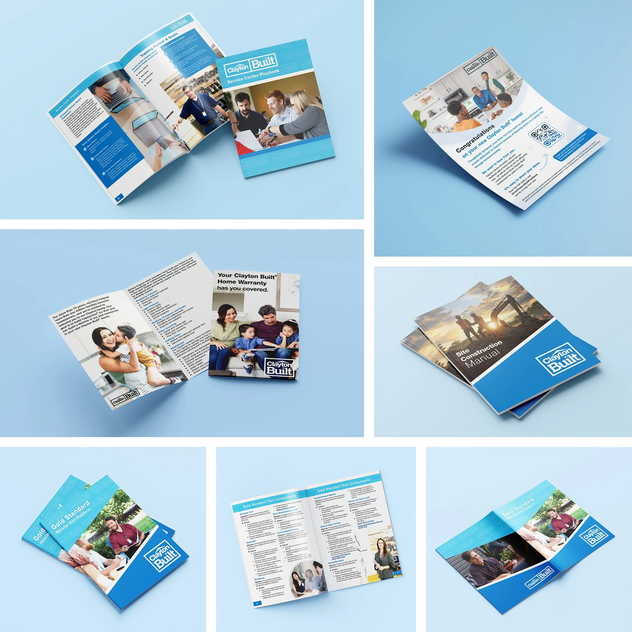
I created new marketing collateral to support the brand refresh and elevate how the company presenta itself to customers and partners. The updated flyers, binders, brochures, and other creative assets feature a modern aesthetic and custom photography, enhancing how Clayton Built® communicates its values.
Marketing Collateral